Dear Bootstrap Why Aren't My Tables Full Width
Perhaps I shouldn't have insomnia and then code into the wee hours because this is an exchange that I can see happening if only I could email Bootstrap in the style of Ann Landers …
Dear Bootstrap,
I was hoping that you could explain to me why my tables of data aren't full width.
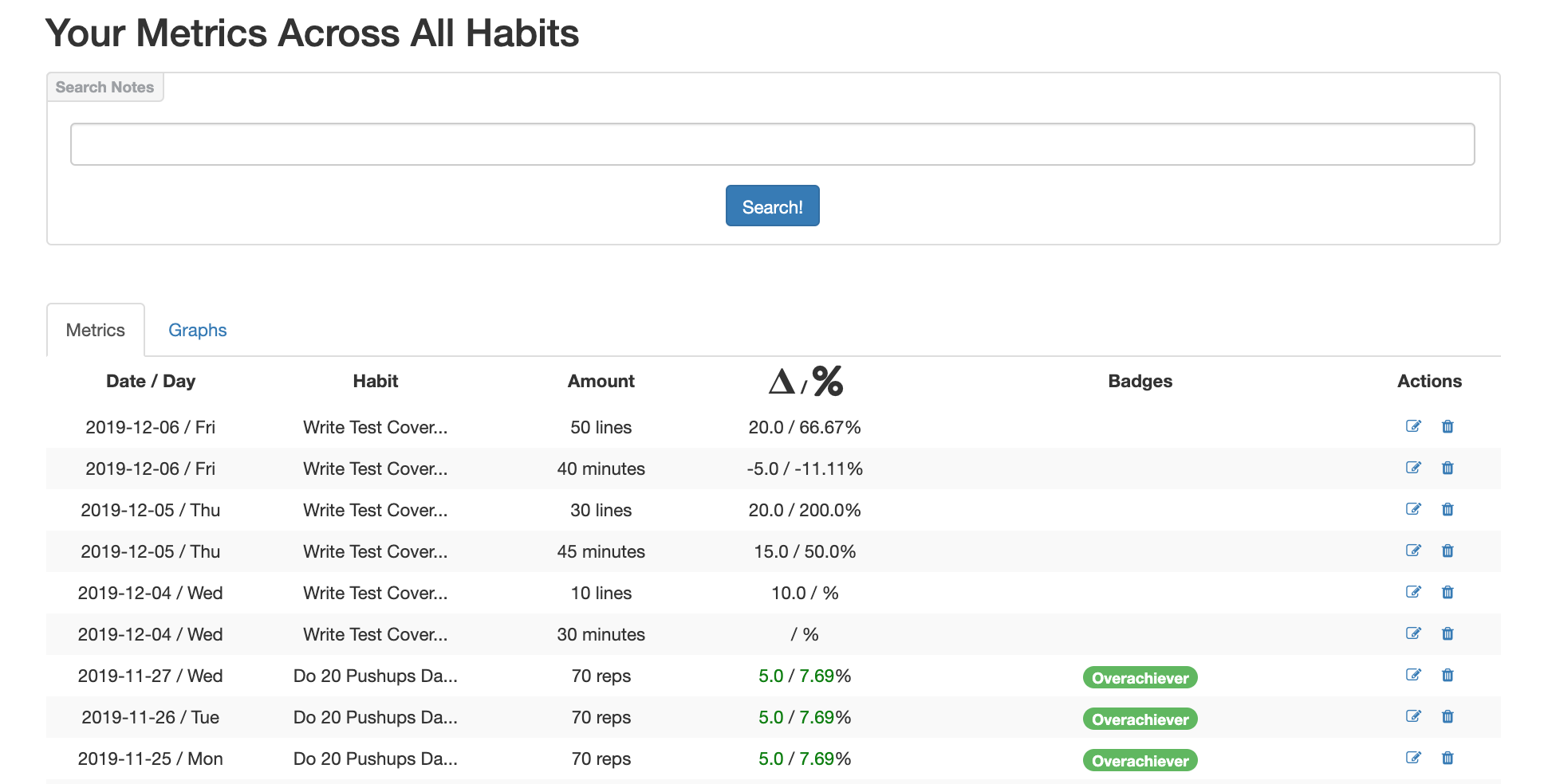
Here's an example which isn't full width:

And here's an example which is:

The difference between the two bits of markup is:
The non full width one:
<table class="table table-condensed table-hover table-striped" style="width:100%">
The full width one:
<table class="table-condensed table-hover table-striped" style="width:100%">
Here's an example of what this looks like in full:

Thank you. Confused Web Developer that Struggles Mightily with CSS
Dear Confused Web Developer that Struggles Mightily with CSS,
I'd love to explain this to you but I also find the bootstrap table model confusing as heck. What I can tell you is that, for reasons, I don't understand, adding table seems to have two effects:
- it improves the lines between the data
- it sets a margin on the table to inset it from the left and right borders
And, no, I can't tell you how to work around this but what I can tell you is this:
When you want a table to span the full width then omit the table class and just use table-condensed. And, yes, you're going to lose the nice lines; so sorry; nothing can be done here.
And I'd direct you to my table documentation where you can find this discussed in full but there's simply no mention of it anywhere in there so I'd assume that even we don't understand this.
My sincere apologies …
Bootstrap 4, Your Friendly Neighborhood CSS Grid
Posted In: #bootstrap #css