David Rovics Community Supported Art or a Tale of PayWoe and UI / UX Failures for Startups to Learn From
Tales on the Internet of problems with PayPal are damn near epic in their size. Everyone, always, seems to have issues with PayPal and I am no exception. Part of this is the nature of PayPal:
- a long running Internet service - I remember the first time I used PayPal and that was three houses ago (not three rented houses; three owned houses); if I measure PayPal in terms of places I have lived then the number is 8.
- focus on a single persistent personal address; I have been using the same email address since the early days of gMail. It is how PayPal knows me but that means there is "contact cruft" attached to it in the form of dead address; dead cell phone numbers
- it is constantly under attack. I read The PayPal Wars back when I worked with Kareem and I've fought spam wars in both email and blog so I understand how being under constant attack changes how you build and design products.
One of the people I grew up with is David Rovics and consider a friend albeit one I haven't seen since 1985. I remember trading comic books with him at his parent's house back in the late 1970s. Our political leanings couldn't be more different - he's a card carrying anarchist / socialist / musican who writes beautiful songs that honestly bring tears to my eyes. Songs of social significance is how he describes them and he isn't wrong. Me? I may live in Indiana but I'm deeply tied to tech entrepreneurialism and the open source world. We could not be more different along ideological lines but I have damn near infinite respect for him.
David is also a writer / blogger and his piece about the differences between America and Europe is illuminating. I don't agree entirely with his conclusions but I also don't argue with the facts. If you like folk music / songs with meaning then his stuff, all freely available on BandCamp is fascinating. Personally I'd highly recommend the Battle of Blair Mountain which tells a dark tale of American labor relations that you don't learn in school – certainly not Wilton High School where David and I attended.
So what does that very long introduction have to do with PayPal? Well David is an artist which means that he sells CDs, tours, etc and he recently introduced his CSA or Community Supported Art program where you can sign up as a member for $50 / year (other options available as well). And I tried, back in September, to signup only to be thwarted by PayPal issues. And then, sadly, I got busy and lost it amongst the weeks of AWS, Ansible, server migrations, code migrations, learning elixir, etc. But you should never forget your friends. Yesterday I noticed that David's main site was down so I dropped him an email and that inspired me to finally fix my PayPal account. In the process I noticed a few UI issues that I found surprising in a site of PayPal's scale.
You would think that a company like PayPal would have a finely tuned UI / UX team around the issues of common problems. Somehow, given what I just experienced, I don't think so. And therein lies the tale.
Problem the First - Login and Verification
This happened yesterday morning and I did not capture any screenshots because, well, my bad. Given that PayPal had old contact info for all my cell phones user verification was tricky but I got past it. To be entirely honest tho I was actually kind of happy that verification was tricky - that means accounts cannot be compromised.
Problem 2 - Expired Card
When I went to purchase from a link from David's site, I got this screen:
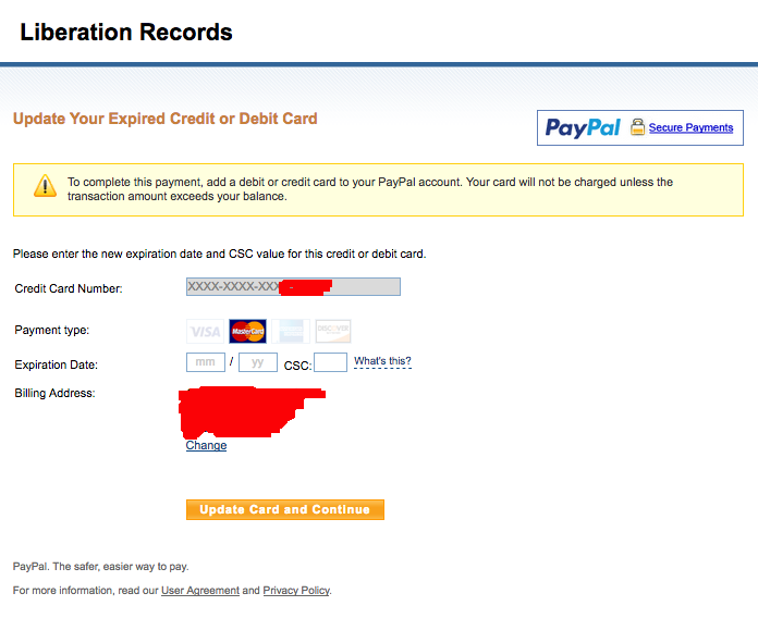
If you notice there is no way to add a new card here and the card that they had on file for me was easily 5 years old. Now I do get that the designers might have been worried about breaking the payment flow by allowing a link to add a new card. But given that I'm not a UI guy and I can easily think of at least one way around that, should't they been able to? I have to think that adding a new credit card is a fairly common thing if you are PayPal. And if the card is as old as I had then shouldn't a link be presented at least in that case if not every case?
Problem 3 - The No No No Screen
So I navigated thru the PayPal ui and finally found where to add a new card – the correctly named "Wallet". So I copied and pasted my details from Enpass (highly recommended btw) and I got what I think of as the No No No screen:
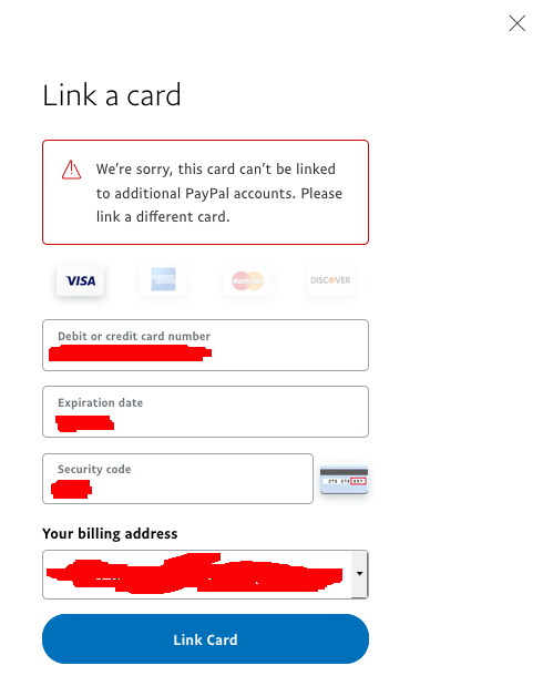
Yeah I get it. My wife has our main credit card attached to her PayPal account but she's sleeping. Time to dig out the wallet and find some other card. But, again, shouldn't there have been a link here to use a different card instead? The web is, inherently, a hyper linked medium – didn't the PayPal designers ever get the memo?
So I navigated backwards thru the UI and found the place to add a different credit card and then went back to my friends site and completed my purchase. Huzzah!
Good Things
There are a few good things that PayPal has done that in all fairness I should point out:
- The list of security questions has been substantially revised. My older security questions where last 4 of social and mother's maiden name. Now it is things like "name of first pet" / "name of favorite childhood stuffed toy". That isn't as good as write your own question but it is much, much harder to find that type of personal trivia online.
- I was able to add a credit card, pay for something and then delete the credit card even tho the transaction might not have been processed yet. That is a wonderful design decision and very much pro user. Kudos!
How to Fix Core Usability if You Are a Startup
The take away here and the reason that I tagged this as startup is that even well established, mature companies get common UI / UX issues wrong all the time. I don't think I'm wrong to think that adding a credit card is a common use case for PayPal and that it should have been a 1 step action from payment. Instead I spent about 15 minutes to do nothing more than complete one purchase. If it wasn't for my friend then there's a very good chance that I would have dropped out – as I did once before.
The single best way to avoid this type of UI disaster is to simply watch your users use your product, take notes and then iterate on your product until that issue is addressed. Then you go back to a different user and watch them try and do the same thing and see if you made it better or worse. And repeat until this whatever that issue is is fixed. I learned this lesson a number of times over the years but most recently from Kouris and Dave.
People, particularly "UX specialists", want to make a big deal out of usability but it really isn't all that hard or even all that expensive. All you need to do, if you want to solve these type of core usability issues, is have the will to do it. You have to take responsibility for the problem, focus on it and then set an agenda like "this week we're going to improve login". It can be absolutely exhausting since you're iterating on the same, often tiny details, over and over but that's part of the game. A software engineer, particularly someone like myself, generally won't take ownership of that kind of problem since our focus is internals but someone on the management or product side absolutely can do this. Sometimes the improvements are absolutely tiny – perhaps better messaging is needed or even just a link. As an example, messaging in one case and a link in both cases would have addressed all of my issues above.
In closing, given the size of PayPal I can actually sort of understand why getting this fixed is hard – I suspect that there are a lot of organizational boundaries to cross and people to deal with. A startup shouldn't have that problem.
Note: Kudos to Acorn for being easy enough to use that even I, a thumb fingered, graphically challenged engineer, could get it right. Recommended.
Posted In: #startup #paypal #paywoe #rant #art #rovics #ui #ux #usability #david_rovics